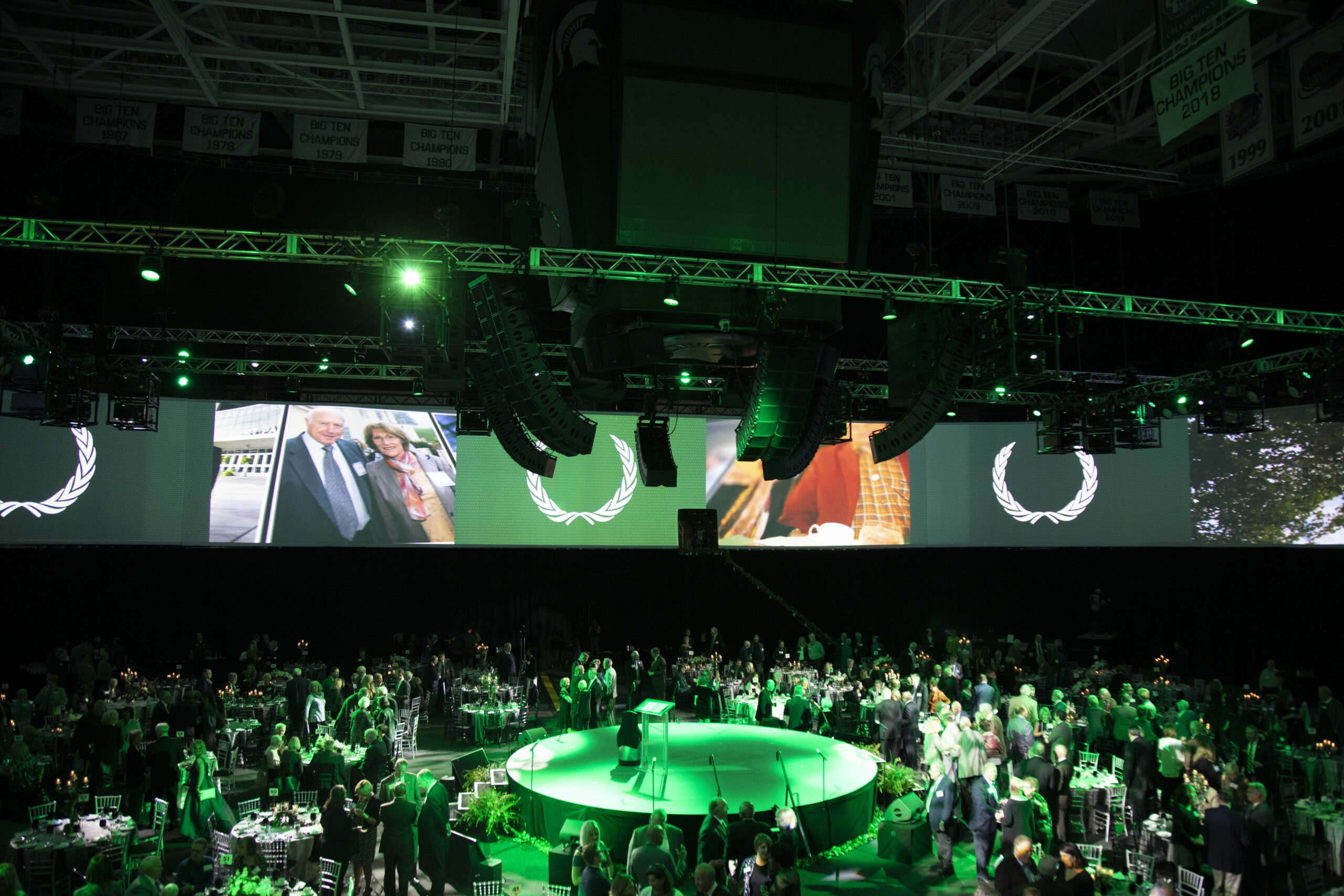
Last week, we talked about my experience within the LED industry. Now, we want to dive into image quality!
In the LED industry, there is no standardized criteria for measuring the quality of images. It has all been very subjective. And though it is just one aspect of determining LED quality, it is one of the most important.
Because the image quality of LED is increasing across the board, we need a standard way to evaluate. So we came up with a handful of points to test when searching for the best LED panels.
Below are the parameters (in no specific order).
Brightness
It’s natural for us to be drawn to the brightest screen. The question here becomes: Is it uniform across each module and across the entire screen?
Color
LED is typically much larger than standard color spaces. There are two general questions to ask here:
- Is it uniform across each module & across the entire screen?
- Does the screen have 12-bit high dynamic range?
Contrast
This is typically measured as a ratio, but there is no industry standard for it. Define what the ambient lighting is for this because that will affect the ratio. The more black the LED is the better.
Color Saturation
This is the intensity of the color, but it’s hard to measure. It’s a parameter that everyone thinks is important, but what I like to do is have a few different people look at it and see what works. This is still subjective, but having more than one person evaluate is important.
Uniformity
This is the surface of the screen. The best way to look at this is with the screen off. Is the color of each mask the same?
Alignment & Gaps
This is really simple. If there are lines between the panels or modules, it doesn’t look good. This one is easy to see. An acceptable gap varies by the pixel pitch (distance from center to center of bulbs) of the LED.
Flesh Tone
Traditionally, this has been one of the more difficult things to reproduce on LED. But for a live event, this is what people typically look for. LED has a tendency to make people look red like they’re embarrassed. So it’s important to test LED with this tone beforehand.
Test Patterns
This test has a series of standard test patterns that we look at. We confirm that you can see the pattern as you’re supposed to.
Flicker
Does the screen flicker? If you can’t make it stop flickering, it’s annoying to the eye, and not acceptable.
Sharpness
What we look for here is the fine detail. Pick a standard image to display across the screen and see if that detail is there.
Color Reproduction
This is if the color you see in real life matches the color on the screen. This is particularly important when you get into company logos. For example, you want to make sure that Coca-Cola red looks Coca-Cola red.
Picture Definition
Definition has to do with the resolution as opposed to the reproduction. Does the resolution of the screen meet the requirements? An acceptable resolution has to do with how far away an audience.
Bit Rate
The end code bit rate affects the quality. We want to make sure that this is high enough to produce a good image. This is really application-specific.
These are not hard and fast rules but there are not industry standards, and that we consistently measure the quality of LED.
Stay tuned for more discussion on LED, its quality, and some applications. If you’re ready to talk about a project, reach out below!


